
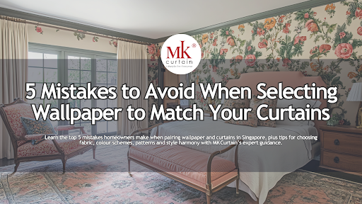
Selecting wallpaper to match your curtains is an important part of creating a harmonious and well-designed space in your home. The right combination can elevate a room’s atmosphere and bring together all the elements of your interior design. However, many homeowners make mistakes that disrupt the balance between the wallpaper and curtains. These mistakes can leave the room feeling mismatched or overwhelming.
1) Ignoring the Fabric and Texture of Your Curtains

One of the most overlooked aspects when selecting wallpaper to match your curtains is the fabric and texture. The material of your curtains plays a crucial role in the overall aesthetic of the room. For instance, pairing thick velvet curtains with wallpaper featuring fine, intricate patterns can create a visually heavy space. Similarly, pairing smooth wallpaper with rough or textured curtain fabrics can lead to a disjointed look.
When selecting wallpaper, always consider the fabric of your curtains. If you have textured curtains like linen or velvet, choose wallpaper that complements the fabric’s weight and texture. A smooth wallpaper or wallpaper with subtle patterns works well with heavier, textured fabrics. On the other hand, lighter curtains made of sheer or cotton materials pair beautifully with wallpapers that have intricate details, such as floral or geometric patterns.
2) Overlooking the Scale and Pattern Size
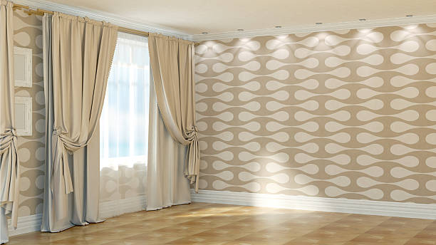
Another common mistake is not matching the scale of the patterns on the curtains and the wallpaper. If the wallpaper features bold, large patterns, pairing it with equally large or intricate patterned curtains can overwhelm the space. The room may end up feeling cluttered and chaotic.
To avoid this, make sure to balance the scale of the patterns. For example, if your wallpaper has large floral prints or geometric designs, choose solid-colored curtains or curtains with smaller patterns to avoid a clash. If your wallpaper is subtle and understated, you can opt for more detailed curtains to add visual interest without overwhelming the room.
A good rule of thumb is to match bold wallpaper with simple or solid curtains. Conversely, if your wallpaper is plain or neutral, go for curtains with bold patterns or textures. This creates a balanced, visually pleasing look where neither element overpowers the other.
3) Choosing Clashing Colours
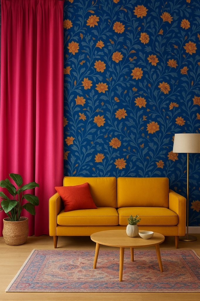
Colour is one of the most important factors in ensuring a cohesive look between your wallpaper and curtains. Choosing colours that don’t complement each other can make the room feel chaotic. While it can be tempting to pair bright, contrasting colours, this approach often leads to a mismatched or overly bold atmosphere that doesn’t allow the room to feel harmonious.
Instead, focus on choosing colours that complement each other. You can either go for a tone-on-tone approach or pick complementary colours to create contrast. If your wallpaper features soft shades of blue, consider pairing it with curtains in a matching shade of blue or soft neutrals like grey or beige. On the other hand, if your wallpaper has a bold or bright design, choose curtains that are in complementary hues to create balance.
It’s also important to consider the undertones of both the wallpaper and curtains. Warm tones like gold and brown go well together, while cooler tones such as blue, green, and grey also work in harmony. By paying attention to the undertones, you can create a space that feels cohesive and well-designed.
4) Forgetting to Consider the Room’s Lighting and Function
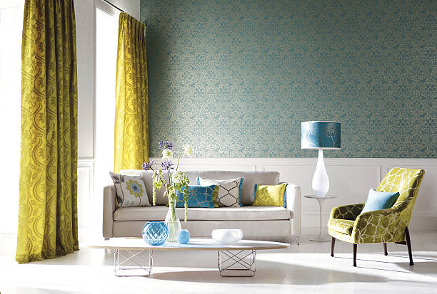
One of the biggest mistakes people make when selecting wallpaper and curtains is not factoring in the room’s lighting and purpose. Natural light affects how colours and patterns are perceived and it’s essential to consider the lighting when choosing materials and designs. A dark room with limited natural light may not benefit from dark curtains paired with dark wallpaper. This combination could make the space feel even smaller and more cramped.
Instead, if the room lacks natural light, opt for light-coloured curtains that will help brighten up the space. Light curtains, such as sheer fabrics, allow natural light to filter through, making the room feel more spacious and open. In contrast, darker colours for both curtains and wallpaper work better in rooms with ample natural light, creating a cozy and intimate vibe.
Additionally, think about the room’s function. Bedrooms may benefit from heavier fabrics like blackout curtains, which promote better sleep, paired with soothing wallpaper colours. In contrast, living rooms can accommodate brighter, lighter curtains with bolder wallpaper to create an inviting atmosphere.
5) Focusing Too Much on Matching Rather than Coordinating
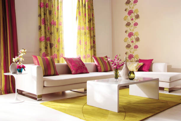
Many homeowners make the mistake of trying to perfectly match their curtains and wallpaper, which can sometimes result in a forced or flat look. While it’s important for the elements to complement each other, trying to match everything exactly can take away from the dynamic appeal of the room.
Instead of aiming for perfect matching, focus on coordination. The key is to select elements that work together harmoniously, rather than looking identical. For example, if your wallpaper has a floral pattern, you can select curtains with a complementary colour in a solid shade or a smaller, subtle pattern that echoes the wallpaper’s design. This coordination adds depth to the space and avoids making the room feel too “matchy.”
Experiment with different fabrics and colours to see how they interact with the wallpaper. Remember, the goal is not to make the curtains and wallpaper look the same, but to create a room where both elements enhance and support each other.
FAQ
How do I match curtains with wallpaper in Singapore?
When matching curtains with wallpaper, consider the pattern and scale of both. If your wallpaper is patterned, choose solid or subtly textured curtains. If your wallpaper is simple, go for curtains with patterns or textures to add interest. Pay attention to the colours and ensure they complement each other.
How do I choose the right curtain fabric to match my wallpaper?
The fabric of your curtains should complement the texture and pattern of your wallpaper. For heavy textured wallpapers, choose light and airy curtains made from cotton or linen. For intricate or detailed wallpaper, select solid curtains that won’t compete visually with the wall design.
What are the best curtain colours for patterned wallpaper?
When working with patterned wallpaper, it’s best to go for neutral or solid-coloured curtains. If your wallpaper is bold, opt for curtains in a complementary neutral colour, such as beige, grey or white. This ensures that the curtains don’t overpower the wallpaper but still enhance the overall look of the room.
Should I use light or dark curtains with dark wallpaper?
If you have dark wallpaper, choose light curtains to create contrast and balance. Light curtains will help brighten up the space, especially in rooms with limited natural light. Conversely, if you have light wallpaper, darker curtains can add depth and create a cozier atmosphere.
Conclusion
Selecting wallpaper to match your curtains is about more than just choosing complementary colours. It’s about finding the right balance between patterns, textures, colours and the room’s lighting. Avoid common mistakes by focusing on coordination, not perfection and considering the function of the space. By keeping these tips in mind, you’ll create a stylish and cohesive room that feels balanced and inviting. If you’re unsure where to start, MK Curtain offers professional advice and a wide range of curtains and wallpapers to help you make the perfect choice for your home.
Visit The MK Curtain Showroom in Singapore

Explore Premium Curtains (Custom and ready-made), Blinds, Wallpaper, and other window furnishing solutions at The MK Curtain Showroom Gallery Located in Ubi, Singapore
Shop Online our Collections
MK Curtain Singapore Boutique Showroom Gallery
33 Ubi Avenue 3, Vertex, #01-01
Singapore 408868
Book an appointment with our Design Consultants to discuss your bedroom, nursery, media room, or other light-control requirements.
Book an appointment with our Design Consultants to discuss the ideal light-control solutions for your BTO house, bedroom, nursery, media room, or any other space in your home.
[Book a Consultation]
[Visit Our Showroom]
[Contact Us on WhatsApp]
