
Curtains play a major role in interior design. They are not only functional but also define the mood and balance of a room, which enhances most of the things. Choosing colour for the curtain can make a space look larger, brighter, cozier or even more stylish. However, picking the wrong choice can overwhelm the room or clash with existing décor. This guide will walk you through practical steps on how to select curtain colours that pop, add character and match with your home’s design.
Why Choosing Curtains Colour Matters

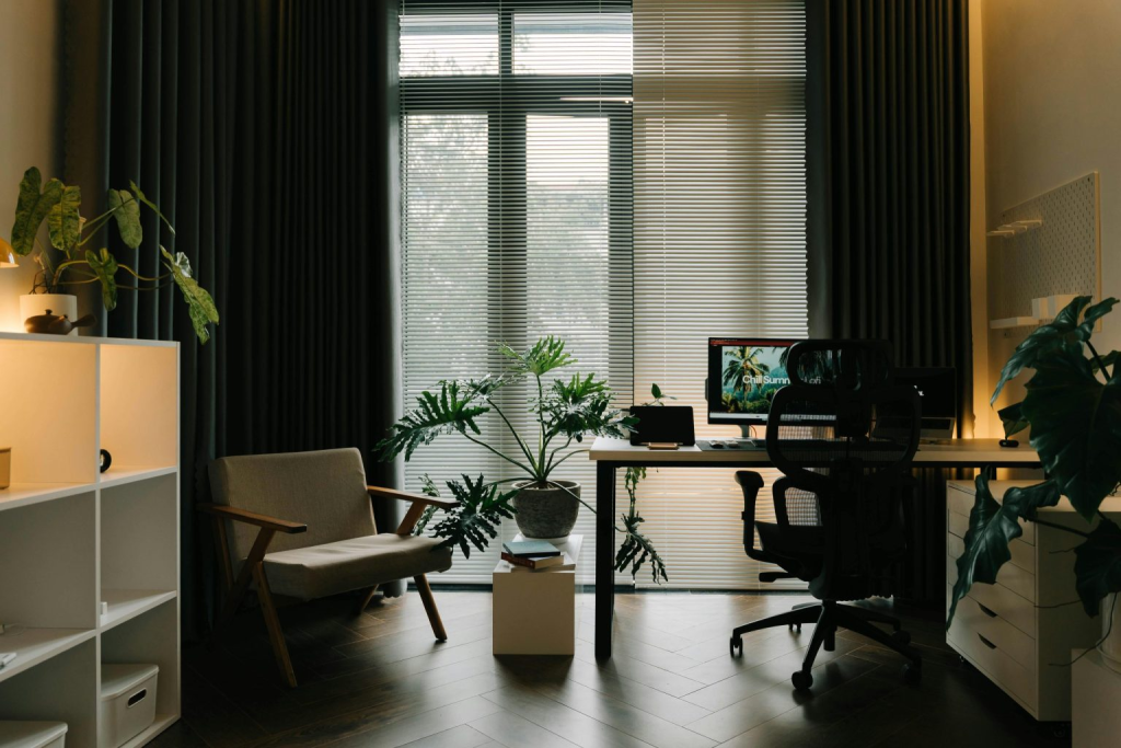
Curtains cover a large portion of vertical space in most rooms. Their colour choice directly affects the atmosphere and comfort. A carefully chosen curtain can complement walls, furniture and floors to create a balanced design. On the other hand, mismatched curtain colours may distract the eye or make the space look smaller.
Curtains also impact lighting. Light colours brighten up rooms with limited daylight, while darker tones absorb light and bring intimacy. Considering the purpose of the room and how you want it to feel is essential when choosing colour for the curtain.
Step 1: Identify the Main Colour in the Room
The first step is to confirm the dominant colour in your space. Look at your walls, floors and large furniture. Which colour takes up the most visual space? That is your base colour. For example, if orange dominates your living room, you should treat it as the main colour.
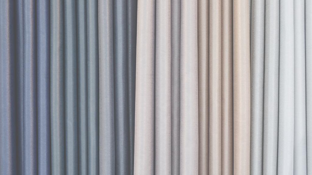
Do not confuse neutral shades with main hues. Black, white, gray and gold are neutral tones that support other colours rather than lead them. They provide balance but should not be considered the primary colour when choosing curtain tones.
Step 2: Define the Theme and Mood of the Space

Every room has a theme. Some spaces feel soft and welcoming. Others feel bold and lively. Once you know the mood, you can select certain colours that support it.
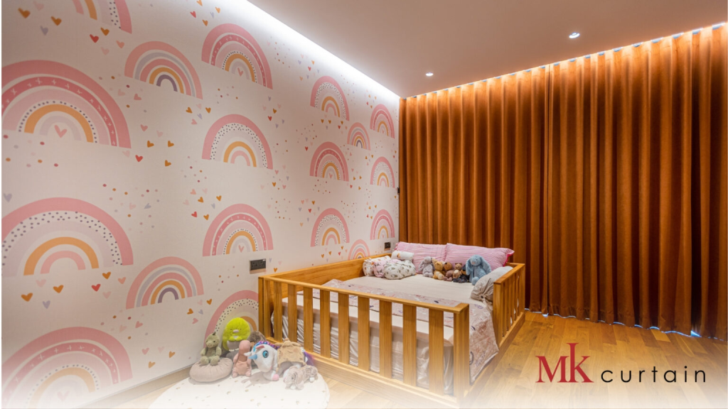
For soft themes, stick with analogous colours within the same family. This creates a warm and cohesive effect. For bold or modern themes, complementary colours add contrast and energy. The key is to think about how the curtain colour will interact with walls, furniture and décor.
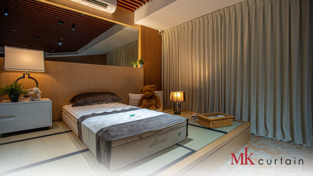
When choosing a colour for a curtain, always match it with the mood you want. A cozy bedroom benefits from muted tones, while a vibrant living room may call for brighter options.
Step 3: Select the Curtain Tone That Works Best
With the main colour and theme in mind, now pick your curtain colour. Start by looking at different shades within the colour family. If orange is the main colour, you could choose burnt orange, peach or terracotta curtains. Each shade creates a different atmosphere.
For small spaces, avoid using the same shade as your main colour. This can make the room feel heavy and closed in. Instead, go for lighter or slightly darker variations. In larger rooms, you can play with stronger contrasts since space allows for visual balance.
Common Mistakes to Avoid When Choosing Curtain Colour
Many people make predictable mistakes when selecting curtain colours. Learning about these will save you time and money.
- Choosing plain white curtains without texture can look flat and dull
- Matching the curtain colour too closely with the wall paint removes contrast
- Using heavy brown or dark tones in bright rooms creates an oppressive feel
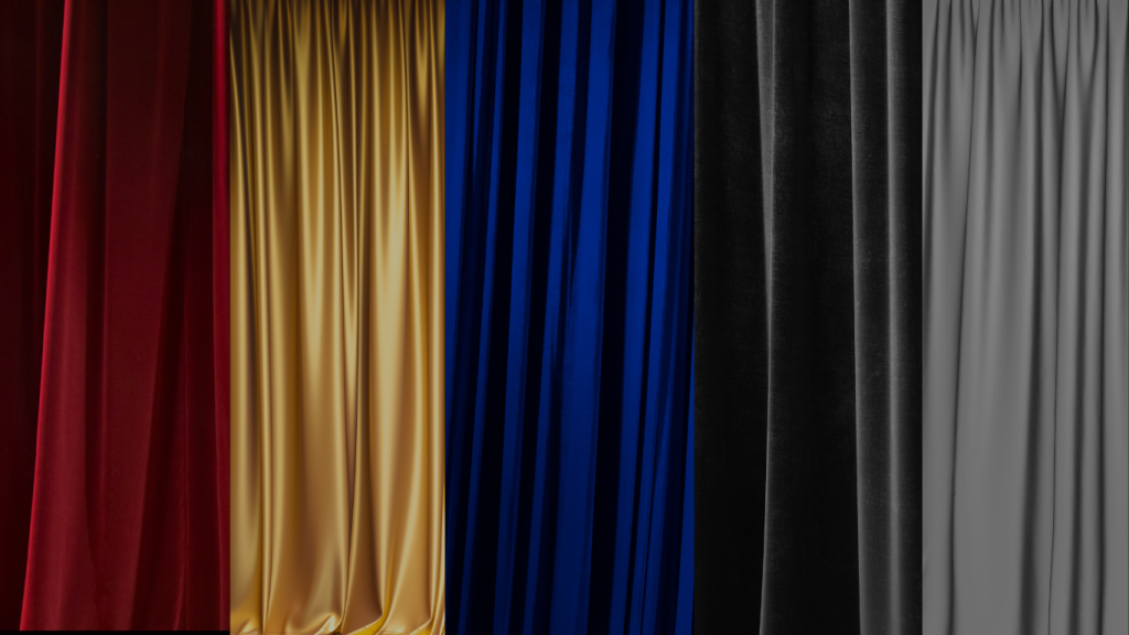
- Selecting bold reds without considering proportion makes the room look theatrical
- Ignoring natural light when testing colours can lead to poor results
Avoid these errors by always testing swatches during the day and at night. The same curtain colour may look different under natural and artificial lighting.
Extra Tips for Curtain Colour Ideas That Pop
Professional designers often use colour theory and practical rules to guide curtain selection. One method is the 60-30-10 rule. Sixty percent is the wall colour, thirty percent is curtains and large décor, and ten percent is accent items. This balance ensures the curtain colour becomes a strong visual anchor without overpowering the room.
Texture also plays a role. Even if you stay within a neutral palette, mixing velvet, linen or silk fabrics adds depth. Patterns are another option. Stripes or florals that include your main colour can bring personality while staying harmonious.
Lighting conditions matter. Rooms with lots of sunlight benefit from darker curtains that block glare. Rooms with limited daylight look better with lighter tones that reflect brightness. Always think about both design and function when choosing a colour for a curtain.
Example: Choosing Curtain Colour in an Orange Room
Let’s apply the steps to a real example. Imagine a room where orange dominates. Orange is the main colour, so we treat it as the base. Black, white, and gray in the same room are neutral and not counted as primary.
If the theme is cozy and soft, you might select peach or terracotta curtains. These are within the same colour family and will enhance warmth. If the theme is bold and modern, you might add a contrasting tone like teal or navy for a striking impact.
If the room is small, avoid using pure orange curtains. They will overwhelm the space. Instead, pick a softer tone, such as light peach or patterned curtains that include orange but balance with neutrals.
Final Thoughts: Choosing the Right Colour Curtain for Your Home
Choosing the colour for the curtain is more than a design detail. It is a process that involves analyzing the main colour of the space, defining the theme and selecting the right tone. Curtains should enhance the atmosphere, complement furniture and manage light effectively.
By following these steps and avoiding common mistakes, you can confidently choose curtain colours that pop. Whether you want a cozy retreat or a bold living space, the right curtain colour helps bring your vision to life.
Check Out Our Video For More Information on Choosing Colour for Curtain
Shop Curtains Now at MK Curtain Singapore!
Check out our Blinds Product Available at https://mkcurtain.sg/curtains-singapore/